by Will Jones, Daily Sceptic:

The more vaccine doses an area of England has received, the greater the number of excess deaths it has experienced, an analysis of official data has found – adding to worries that the novel Covid vaccines are contributing to the sharp rise in excess deaths seen since mid-2021.
The analysis looked at excess death rates and vaccination rates for all 300-plus lower tier administrative areas in England. It used the pre-pandemic five-year average (2015-19) as a baseline and controlled for confounding factors such as age and deprivation by comparing the findings in the vaccination era to those in the first Covid wave, before vaccines were available (Figure 1).
TRUTH LIVES on at https://sgtreport.tv/
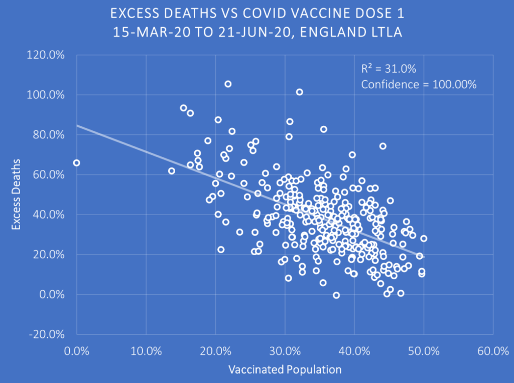
In the first wave (March 15th to June 21st 2020) the areas which would go on to be more highly vaccinated had lower excess deaths on average (the reference vaccination rate is as of March 7th 2021, first dose only). This is a result of the healthy vaccinee effect, whereby people who choose to get vaccinated tend on average also to be people who had better health outcomes pre-vaccine (note that vaccination and health both tend to correlate with wealth). As a result, even if the vaccine was a placebo that had no effect, more-vaccinated areas would have fewer excess deaths on average than less-vaccinated areas. The downward slope in the chart above is thus a baseline for what happens after vaccine rollout. After the vaccination rollout, if the slope becomes steeper then it means that the more-vaccinated areas have even lower excess deaths than they did before the rollout, indicating the vaccine may be lowering the death rate and saving lives as intended. On the other hand, if the slope becomes shallower or reverses direction then it means something is counteracting the background health advantage of the more-vaccinated areas, suggesting the vaccines may be having the opposite effect of the intended one and increasing excess deaths.
The analysis looked at the three periods of excess deaths in England after the vaccine rollout (Figure 2). These are, broadly, the Alpha period of winter 2020-21 (December 20th 2020 to March 7th 2021), the Delta period of the second half of 2021 (June 27th 2021 to January 9th 2022) and the Omicron period of 2022 (March 27th 2022 to January 1st 2023) – though it’s important to keep in mind that for the Delta and Omicron periods many or most of the excess deaths were not Covid related.
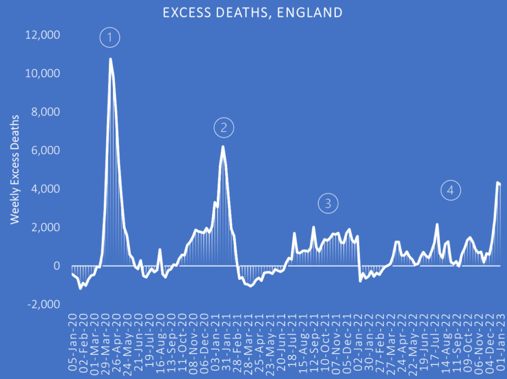
The low vaccine coverage during the Alpha period, very early in the rollout, make the findings for that period uninformative and they have been omitted here.
The results for the double-dosed during the Delta period, on the other hand, are striking (Figure 3). (N.B. ‘double-dosed’ here doesn’t include triple-dosed; the 0% vaccinated point is the City of London.)
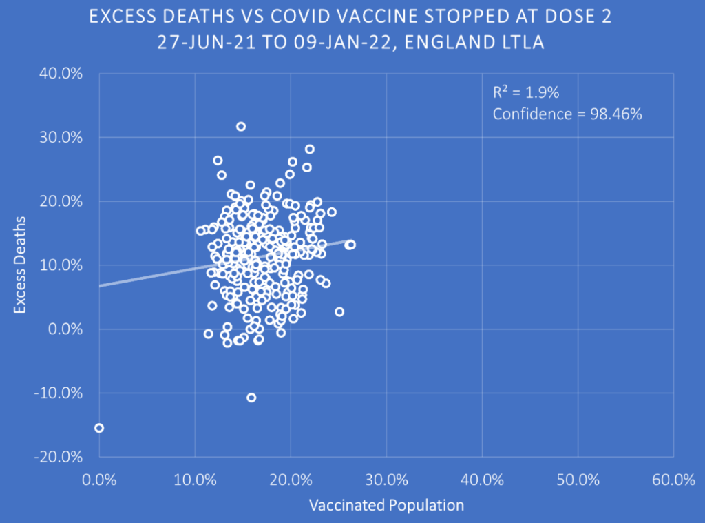
The downward slope of the pre-vaccine baseline (the healthy vaccinee effect) has gone completely, and now there is a shallow upward slope. Far from the more-vaccinated areas seeing improvement from the vaccine, then, those areas have seen their death rates increase so that they now are slightly higher on average than the less-vaccinated areas. This worrying finding is only confirmed when we look at the triple-dose data for the same period (Figure 4).
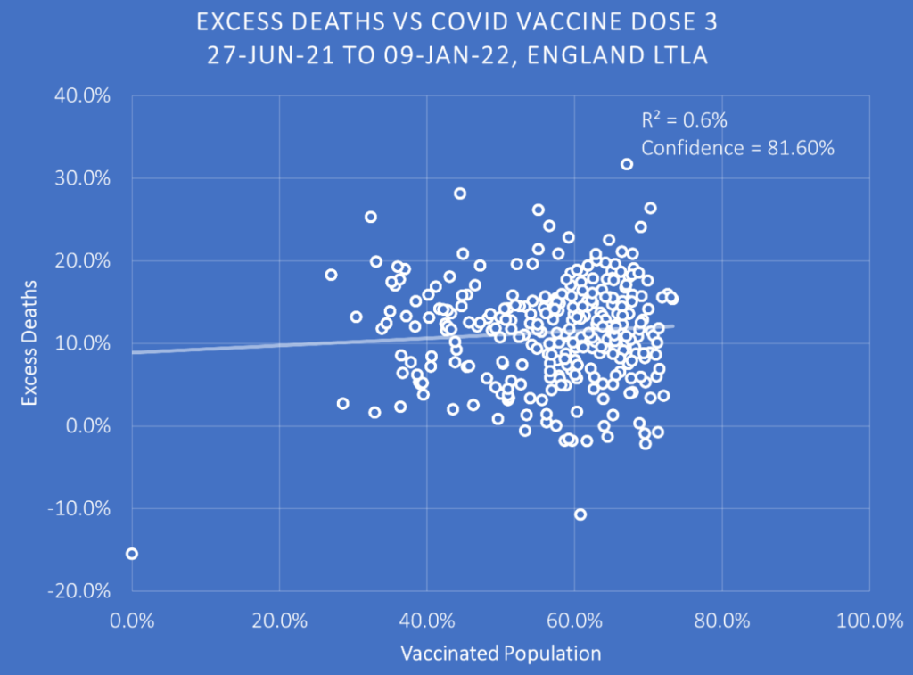
Once again, areas with higher third-dose coverage, far from seeing an improvement in outcomes over the pre-vaccination baseline, see excess deaths increase to the point that the more-boosted areas are slightly worse off than the less-boosted areas, the downward slope now reversed into a slight upward slope.
Worse, the upward slope only gets steeper as we move into 2022 and the Omicron period (Figure 5).
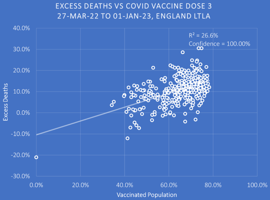
Here, the significant upward slope indicates that the excess deaths in 2022 are much more concentrated in more-vaccinated than less-vaccinated areas of England. This would be bad enough, but recall that the baseline is the ‘healthy vaccine effect’ whereby the excess death rates pre-vaccine were significantly lower in what would become the more-vaccinated areas. Putting the two charts side-by-side (Figure 6) shows the stark difference in excess death rates before and after the vaccine rollout.
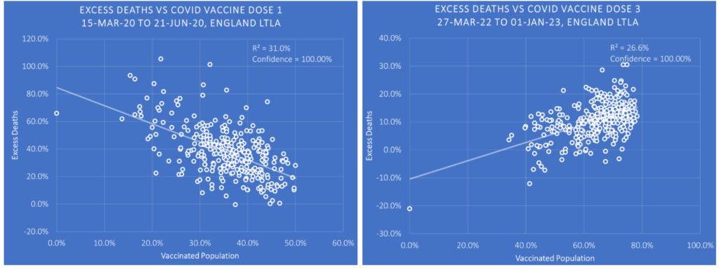
The reversal in the slope is indicative of a major reversal in the health outcomes of the more-vaccinated areas. It may be that the reason for this change is not the vaccine – full data by vaccination status are required to confirm or refute this. But given that most of the other likely factors (e.g. age, deprivation, background health conditions) are controlled for by the fact that areas are being compared to their own historic baselines, it is hard to think what it could be. (To be fair, some of it may be mortality displacement from 2020 owing to more people in the less-vaccinated areas dying earlier on, though that can’t be all of it given the trend gets worse for the more-vaccinated areas over time rather than better.)
At any rate, it offers no support to the claim that the vaccines reduce overall deaths, suggesting that any finding that claims they do may be a result of the healthy vaccinee effect.
Data analyst Joel Smalley, who is behind the analysis, commented: “As always, remember, the burden is not on me to prove that Covid jabs result in higher excess deaths, the obligation is solely on the jab pushers to prove unequivocally that they reduce death.”


