

by Steve Kirsch, Steve Kirsh’s Newsletter:
 If you wanted to prove the vaccine worked, this is the data and approach you’d use. It shows the COVID vaccine was a failure. If you followed their advice, it increased your risk of dying.
Executive summary
If you wanted to show the American public that the COVID vaccines saved lives, the easiest proof is to plot each state (or county) based on its vaccination rate (x axis) and its change in mortality from pre-vaccination baseline on the y-axis.
TRUTH LIVES on at https://sgtreport.tv/
I did this. The slope is positive.
This means that more vaccinations are associated with higher mortality.
Can this be challenged?
I don’t think so.
The data is the data. They can’t change it. And there is only one way to draw a line through the data. If the shots worked, the slope would be strongly negative and it’s not.
This is likely why not a single paper attempts to do the most obvious analysis. They probably did it, saw that it was not supporting the narrative, and then decided not to publish.
Results for state regression and county regression
The slope was positive and statistically significant for both the state and county analysis. This means that the COVID vaccines did the opposite of what they promised: it increased your risk of death.
The R2 value of .31 is quite spectacular and it means this isn’t an accident.

And it’s positive slope for 2021 and 2022 individually:


County data
All counties analysis shows the same thing:


Here it is by each year individually starting with 2021:

For 2022:

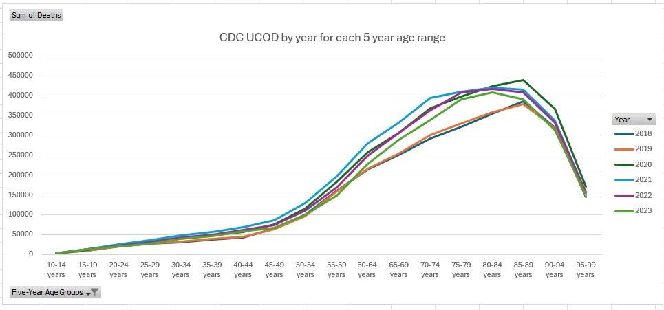
Baseline mortality (the troughs) went up significantly after the shots rolled out

Look at 40-44 year old mortality before the shots rolled out vs. after the shots rolled out. 35% higher baseline mortality, but nobody noticed (except me)

75 year olds baseline mortality

You can see the 20% increase in this chart as well

You can also see that no miracle occurred in 2021 or 2022
The gap between baseline and 2020, 2021, and 2022 are all similar for the elderly who supposedly are now “supposed” to immune to COVID. So what’s killing them at the same rate? Did COVID “suddenly” become more deadly and the vax exactly equalized it? I don’t think so. In 2022, people weren’t dying from COVID anymore, but the ACM was just as high as it was in previous years since the vaccine rolled out.
Read More @ kirschsubstack.com

