

by David Stockman, Activist Post:
Here we go again. The Fed has spent the last 16 years fueling the mother of all financial bubbles on Wall Street. And by way of spillover effects on the mortgage market, it has also fostered parallel bubbles in commercial and residential real estate assets alike, across the length and breadth of the land.
Now these bubbles are once again bursting, of course, under the inexorable force of economic gravity (i.e. unsupportable debt and absurd valuation multiples), meaning that both ends of the Acela Corridor will be soon bleating loudly for another round of bailouts and frenetic money printing. But before the powers that be are able to rekindle yet another monetary rinse-and-repeat episode, the question recurs as to what has been accomplished since August 2008 by the $6.5 trillion increase in the Fed’s balance sheet over that interval?
TRUTH LIVES on at https://sgtreport.tv/
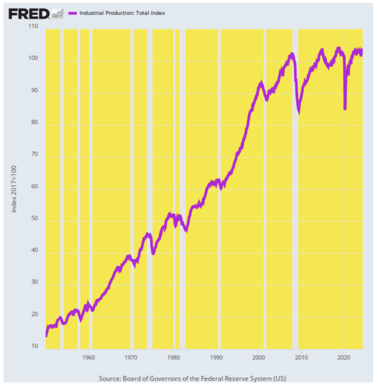
Well, when it comes to measuring the bread and butter output of the US economy—manufactured goods, energy, mining and gas, electric, and other utilities—the answer is pretty much nothing. The industrial production index today stands hardly a tad above its August 2008 level. To be exact, the index has gained just 0.15% per annum during the last 16 years.
That’s an abrupt comedown from the prior trend. As it happened, between 1950 and 2008, the industrial production index rose by 3.50% per year. That is to say, unprecedented money-pumping and the resulting diminutive level of interest rates generated an industrial output growth rate equal to only 4% of its historic level, and not for a year or two but the better part of the first quarter of the Twenty-First century.
Industrial Production Index, 1950 to 2024
Our Keynesian monetary central planners, however, would say the flatlining of industrial production makes no nevermind because they have managed to keep total GDP expanding at an arguably respectable rate. Thus, between Q2 2008 and Q2 2024 real GDP rose from $16.9 trillion to $22.9 trillion or by 1.91% per annum, according to the official statistics. That was well short of the 3.41% per annum growth rate over the same 1950 to 2008 interval, but at 56% of its historic average, it wasn’t macroeconomic chopped liver, either.
Except, except. When you look at the internals, the real GDP woodpile is heavily populated by statistical skunks—most especially when it comes to the inflation indexes used to deflate the nominal data for spending and output. And, if you materially undercount inflation you can easily turn a macroeconomic sow’s ear into the semblance of a silk purse.
As reported, for instance, the goods component of real GDP rose from $3.37 trillion in Q2 2008 to $5.45 trillion in Q2 2024. That $2.08 trillion gain computes to a fulsome growth rate of 3.05% per annum, thereby lifting the top-line real GDP figure considerably.
But we’d say, not so fast. The official GDP accounts also say that the inflation rate for this component of “real” GDP averaged only +0.73% per annum for the entire 16-year period—including the huge inflation flareup since 2021. Anyone who has spent the last decade and one-half in the real world who believes that fanciful figure either works for the Fed, Wall Street, or a swampland real estate broker in the Everglades.
To the contrary, we’d put the odds heavily on at least a 2.0% average goods inflation rate over the 2008-2024 period, meaning that the goods component of real GDP likely grew at $1.1 trillion over the period, not $2.0 trillion.
Likewise, the official counts claim that the $2.74 trillion healthcare component of GDP (Q2 2024) grew by 2.68% in real terms over the 16-year period from a level of $1.79 trillion in Q2 2008. That might sound reasonable until you note that the nominal figure for health care PCE was deflated by just 1.95% per annum.
Of course, that merits the proverbial, puleeese! The health sector is an inflationary trainwreck owing to the fact that massive government and third-party reimbursement system totally neuters the normal checks and balances in the marketplace owing to consumers watching their checkbooks. So it actually takes some gall on the part of the green eye-shades at the BLS to claim that medical care inflation came in at less than 2% per annum.