

by Peter Schiff, Schiff Gold:
Money Supply is a very important indicator. It helps show how tight or loose current monetary conditions are regardless of what the Fed is doing with interest rates. Even if the Fed is tight, if Money Supply is increasing, it has an inflationary effect.
One key metric shown below is the “Wenzel” 13-week annualized money supply figure. It was made popular by the late Robert Wenzel who tracked the metric weekly as an indicator of where the economy might be headed. In 2020, the Fed started reporting the data monthly instead of weekly. It should also be noted that Money Supply data can be heavily revised in future months.
TRUTH LIVES on at https://sgtreport.tv/
Recent Trends
Seasonally Adjusted Money Supply is delayed by a month. The three periods of increased money supply are from March through May.
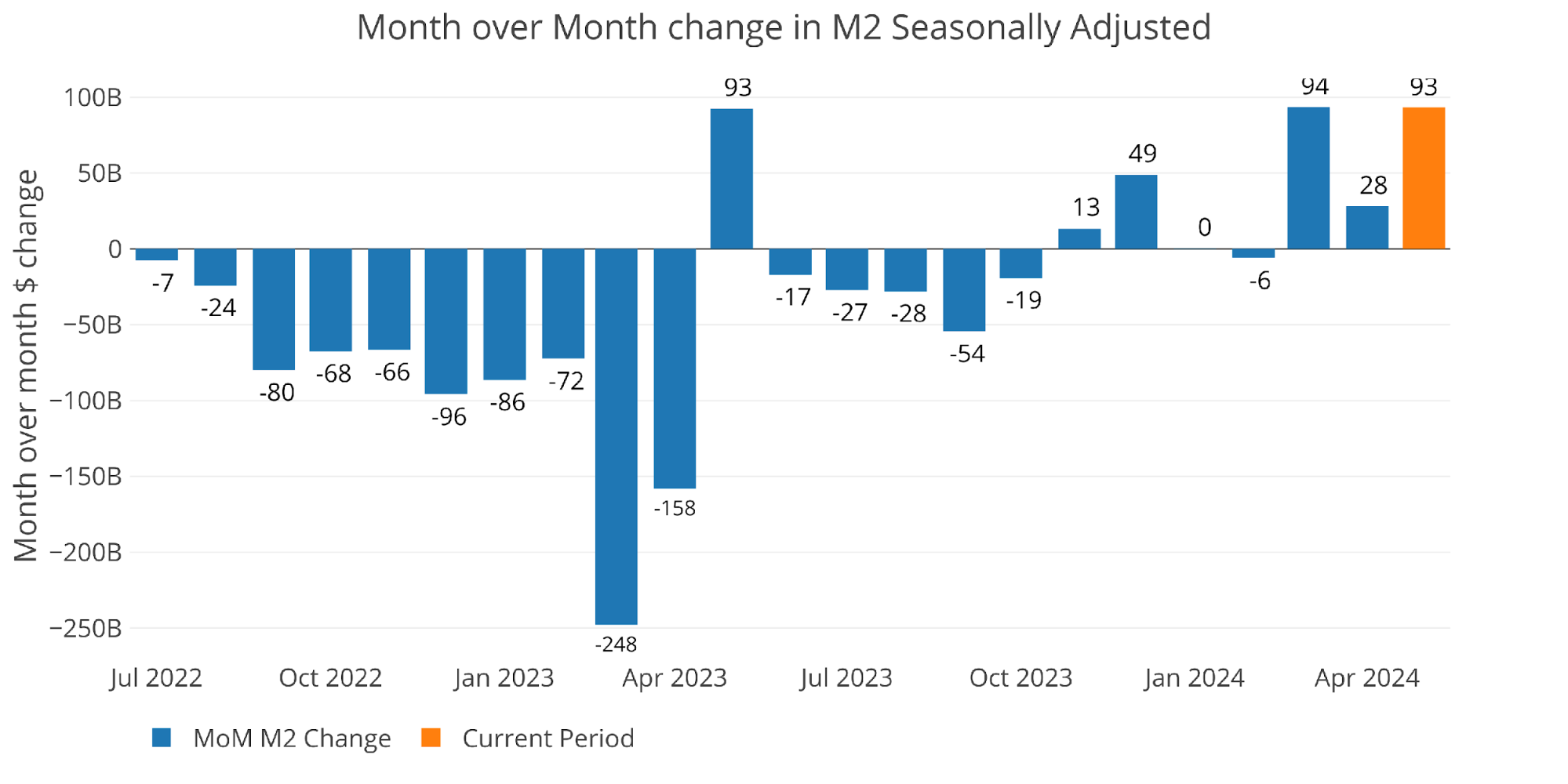
Figure: 1 MoM M2 Change (Seasonally Adjusted)
May saw a fairly large increase of 5.5% annualized.

Figure: 2 M2 Growth Rates
That is slightly below the average of +6.7%.
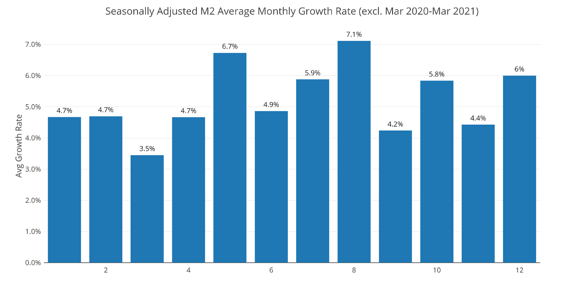
Figure: 3 Average Monthly Growth Rates
Non-seasonally adjusted numbers show data through early June, with a similar large uptick in the latest month.
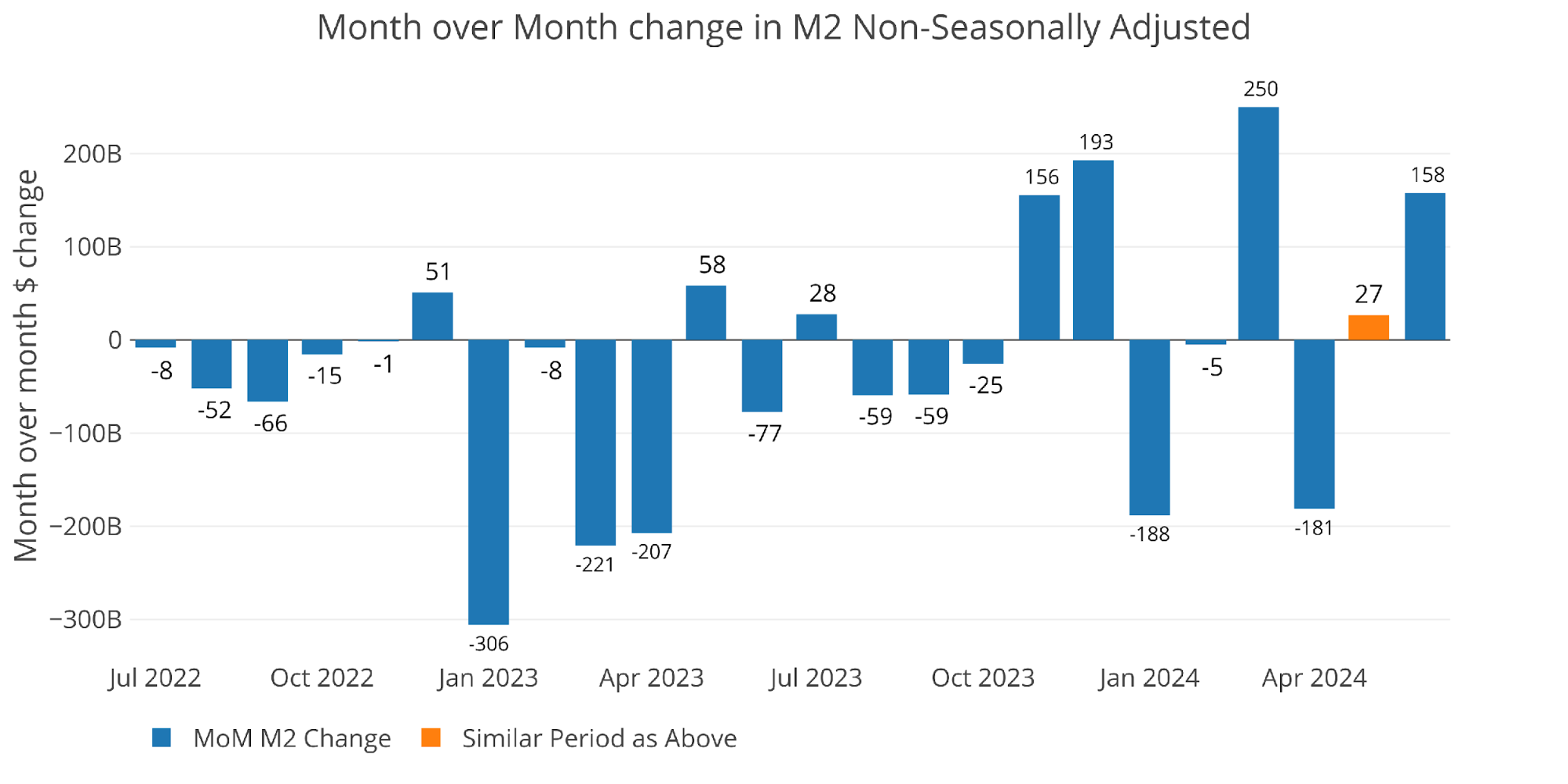
Figure: 4 MoM M2 Change (Non-Seasonally Adjusted)
The weekly data below shows the activity at a more detailed level. You can see the big spike in the latest week.
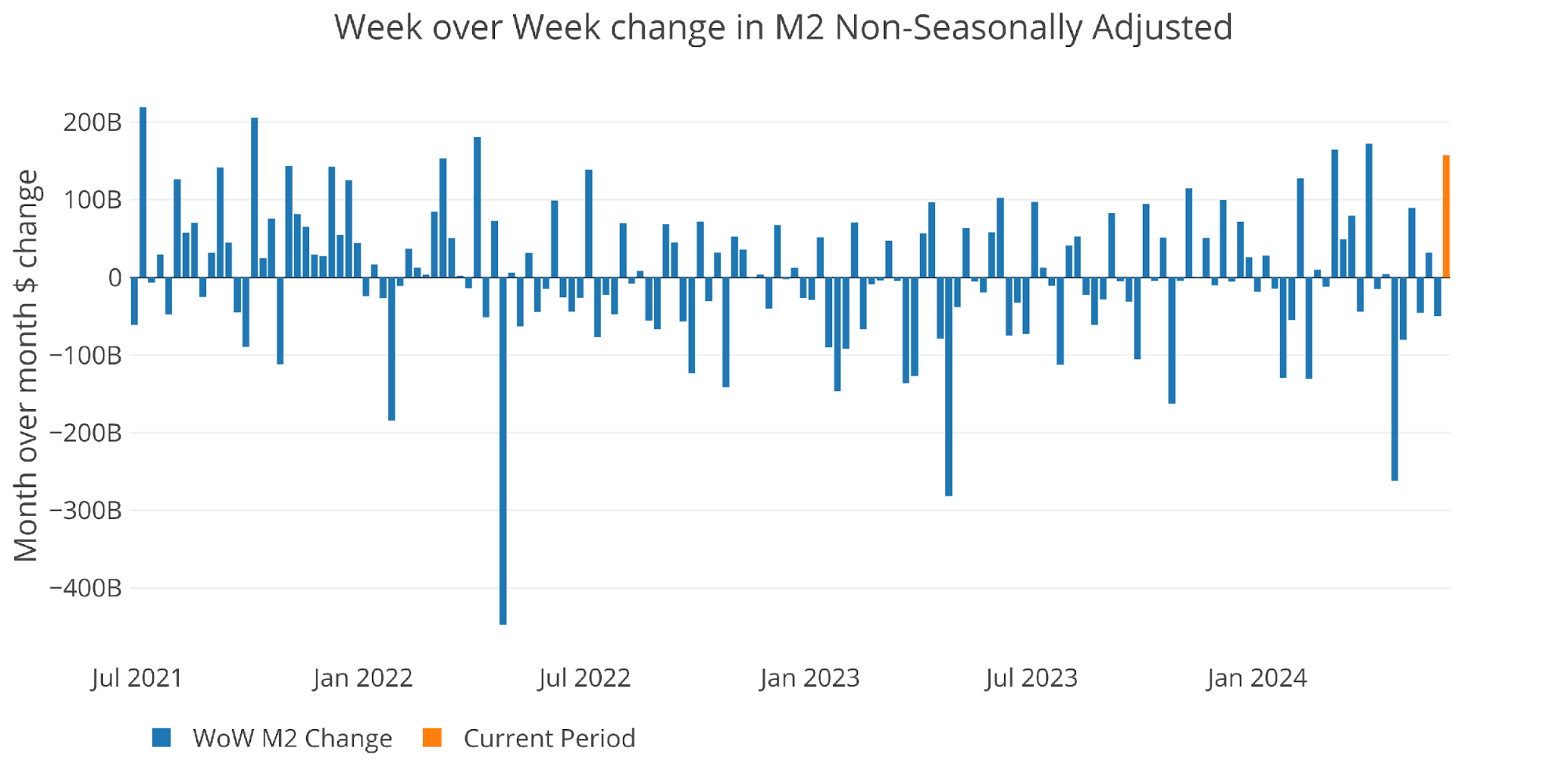
Figure: 5 WoW M2 Change
The “Wenzel” 13-week Money Supply
The late Robert Wenzel of Economic Policy Journal used a modified calculation to track Money Supply. He used a trailing 13-week average growth rate annualized as defined in his book The Fed Flunks. He specifically used the weekly data that was not seasonally adjusted. His analogy was that in order to know what to wear outside, he wants to know the current weather, not temperatures that have been averaged throughout the year.
The objective of the 13-week average is to smooth some of the choppy data without bringing in too much history that could blind someone from seeing what’s in front of them. The 13-week average growth rate can be seen in the table below. Decelerating trends are in red and accelerating trends are in green. The last 20 weeks have been fairly flat with a slight tilt towards acceleration, but not meaningfully so.