by Steve Kirsch, Steve Kirsch’s newsletter:
 In March 2023, MIT Professor Retsef Levi disclosed a troubling figure produced by the Israeli Ministry of Health. This is unassailable proof the vaccines are killing people. Nobody noticed.
Executive summary
- The vaccines are clearly killing people. You can see that from the Israeli MoH data. But that data was first made public in a tweet from MIT Professor Retsef Levi on March 7, 2023. It made no difference.
TRUTH LIVES on at https://sgtreport.tv/
- The medical community and health authorities are simply inept or corrupt or both. You cannot have a 9X variation in Figure 2. That’s crazy. Any sane person would have demanded an end to the vaccine program immediately. How come everyone in mainstream medicine missed this?
- Your risk of death monotonically increases from the time you get the shot, peaking at around 3 to 4 months after shot #2. For other doses, it just climbs and then plateaus.
- The mortality risk curve is opposite in slope to what doctors expect (you are more likely to die later than sooner), so doctors fail to associate a death with the vaccine injection. This allows the vaccine to hide under the radar undetected.
- Your risk of death increases exponentially with each shot number. For example, if your risk of death increased 5% on shot #1, it might increase another 6% on shot #2, another 9% on shot #3, 18% on shot #4, 50% on shot #5, etc. It’s like shooting yourself with a poison each time. This explains why the excess deaths keep going up worldwide even though booster adoption is going down.
- Lot variation is real. Some lots kill 30X more per dose than others. How is that possible with a safe vaccine? This alone should kill the “safe and effective” narrative.
- The healthy vaccine temporal effect is complete bullshit, a gaslighting technique used to explain the data. The Israeli data shown below makes that crystal clear. HVE, if it exists, should be an exponentially decaying effect like the charge curve of a capacitor.
- The lack of transparency of record-level public health data allows them to keep killing people without getting caught. Nobody pushing the jabs is calling for data transparency of public health data. This is a huge red flag. This is a sign of a corrupt, out of control government. And no, you cannot FOIA this information. That has never been done anywhere, ever. Once this data is made public, it’s all over.
If the government wants to stop all the COVID vaccine misinformation instantly, the solution is to set the data free as I wrote about in the past. Why are they not doing this? Answer: Joe Biden would then have to hold himself accountable for all the Americans killed under his leadership to push the jabs.
Not a single pro-vaccine advocate is calling for data transparency of public health data. No vaccine manufacturer is calling for it either. If the vaccines really worked, the drug companies would have put it in their contracts to force the states to release the public health data so they can show people how good the product is and stop all misinformation superspreaders like me from getting any traction with the public. Instead, they seem to want all the data to be hidden for 75 years at a minimum. How is that in the public interest? That tells you everything you need to know, doesn’t it?
About the MoH data
I’m certain now that the MoH data was not gimmicked because I’ve compared it with other data where I know the provenance and it matches up (i.e., death rate on shot 2 peaks at around 100 days and is around 2x the minimum death rate). Also, if they gimmicked the data, they wouldn’t be trying to hide it behind a firewall; they’d make it public.
It is now not behind a firewall and can be found here.
MoH data proves the vaccines are killing people
I first published this data on March 9, 2023 in my article: New Israeli MoH study shows COVID vax increases your risk of death over time.
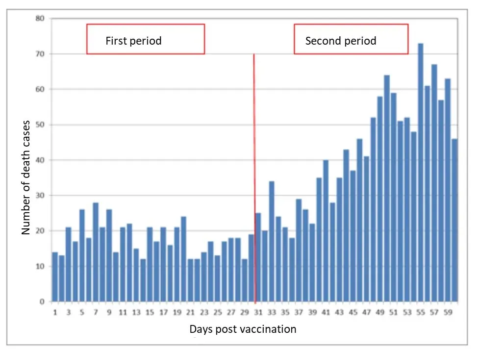
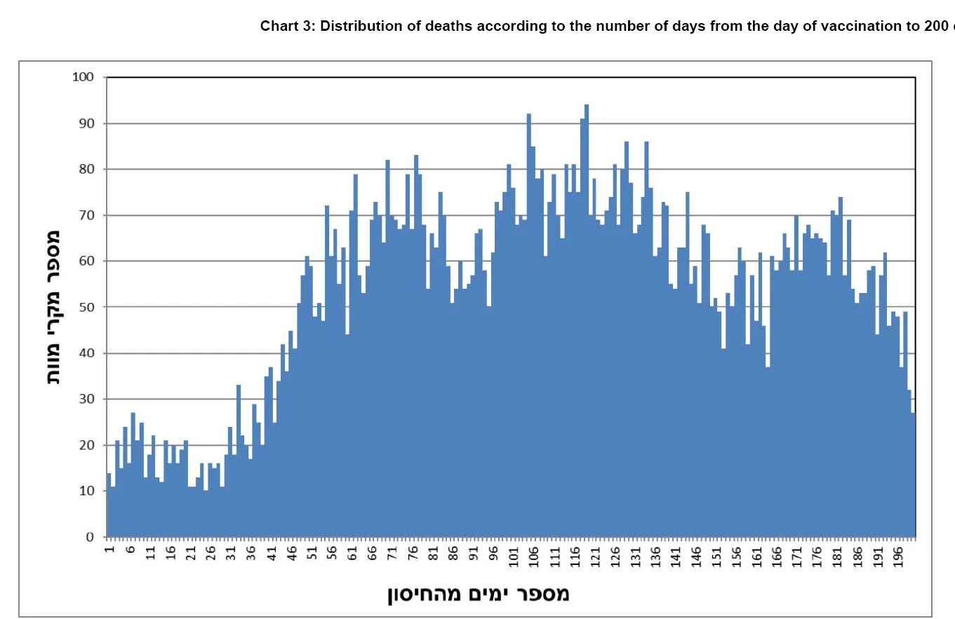
Here are the two key graphs from that article. Both are day till death if you most recent shot is shot #2:


Figure 2 is a train wreck
You cannot have a 9X variation in bar height with a safe vaccine. Sorry. No possible way.
The medical community is ignoring this. This is unconscionable.
Figure 2 is screaming: “I am killing people. Stop me.”
Everyone looks the other way, except me. I’m the only guy in the world, AFAIK, calling this out. This is crystal clear.
Attempts to gaslight people
People attempted to explain Fig. 2 using thing like:
- The mythical healthy vaccinee effect aka HVE (the temporal type)
- Seasonality (older people die at a much higher rate in the winter)
These explanations don’t fit the data:
- HVE is zero. If there was any HVE, the first bar would be lower than all other bars. But the bars touch the lowest point many times in the first 30 days as can be seen from the MoH data.
Read More @ kirschsubstack.com


