by Peter Schiff, Schiff Gold:

The Federal Government ran a deficit of -$39B in January. While that may not seem like much, it looks worse when compared to the average January.
The chart below shows the month of January historically. The government actually ran a surplus in January the four years leading up to 2020. Even last year the government ran a surplus greater than $118B. YoY the chart shows that expenses increased by a wide margin while revenue decreased.
TRUTH LIVES on at https://sgtreport.tv/
Figure: 2 Historical Deficit/Surplus for January
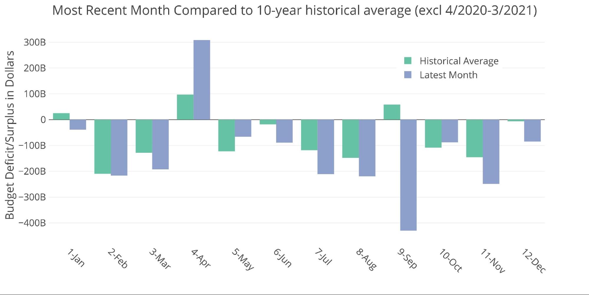
For the decade before Covid, January averaged a surplus of $25B, so this January is definitely off the mark. Let’s look through the data…
Figure: 3 Current vs Historical
The Sankey diagram below shows the distribution of spending and revenue. The Deficit represented only 8% of total spending while Income Taxes accounted for 54% of the total spent.
Figure: 4 Monthly Federal Budget Sankey
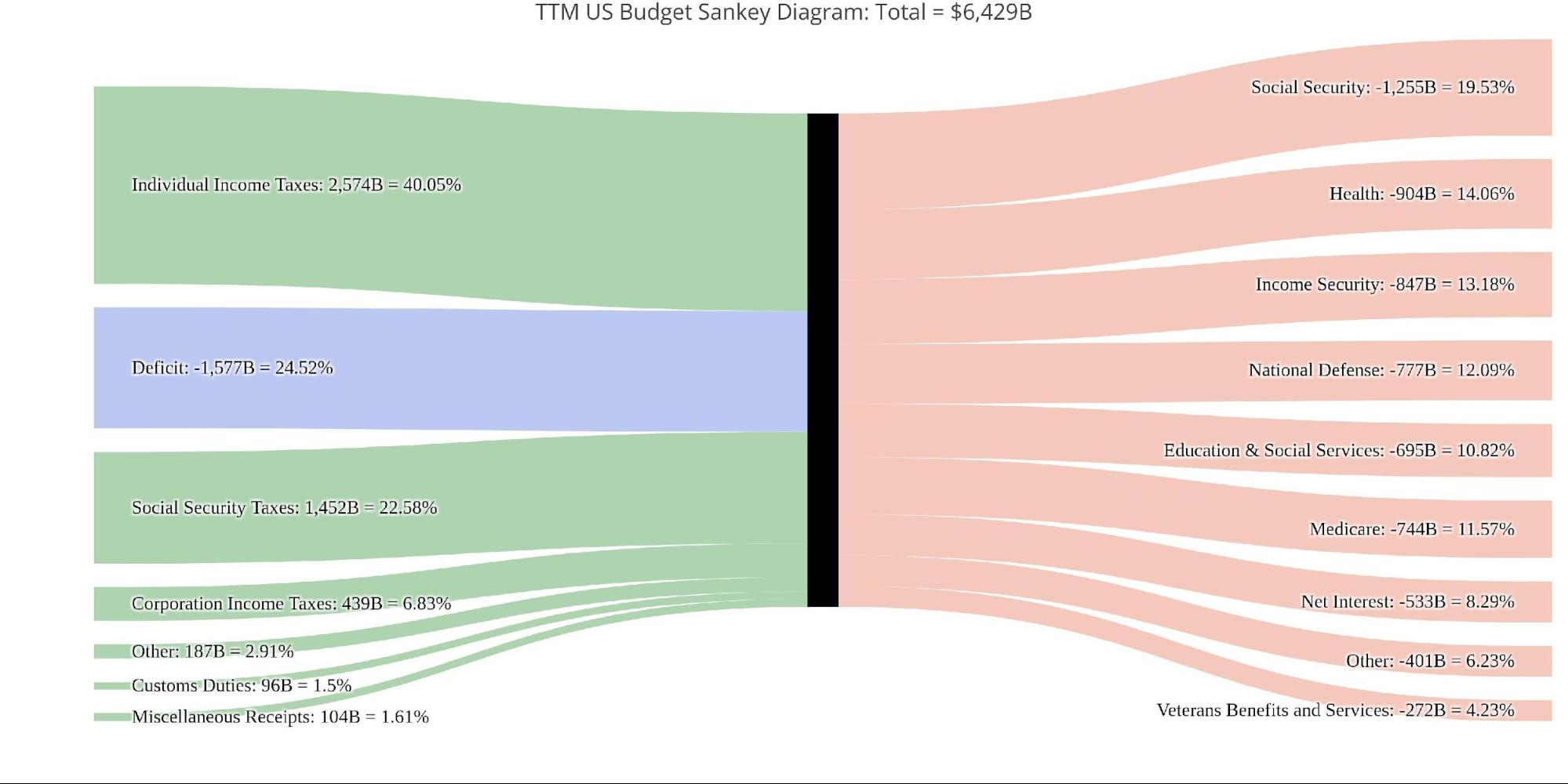
Looking at the TTM, the January deficit saw a very different distribution where the deficit represented 24.52% of overall spending with Income Taxes only covering 40%.
Figure: 5 TTM Federal Budget Sankey
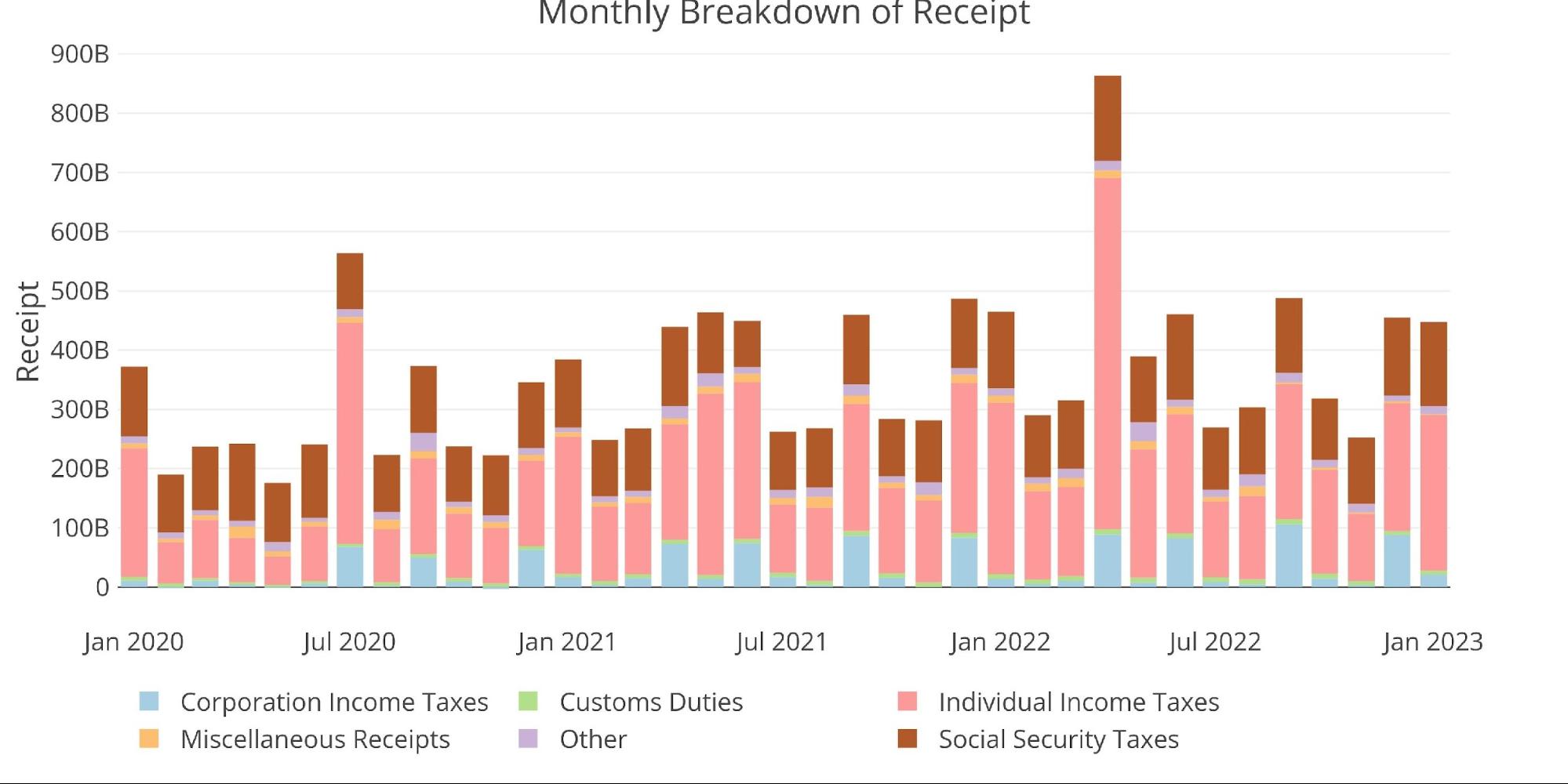
January saw the largest monthly revenue from Net Income Taxes since April of last year. This helped offset the MoM fall in corporate taxes.
Figure: 6 Monthly Receipts
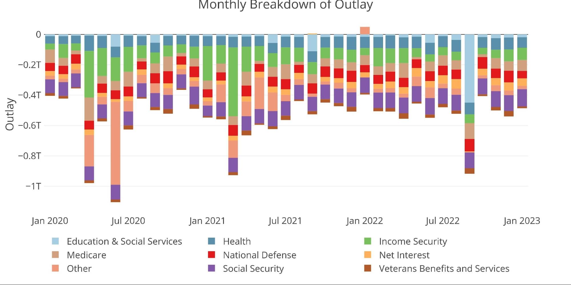
Total Expenses were down slightly, mostly attributable to a drop in National Defense spending.
Figure: 7 Monthly Outlays
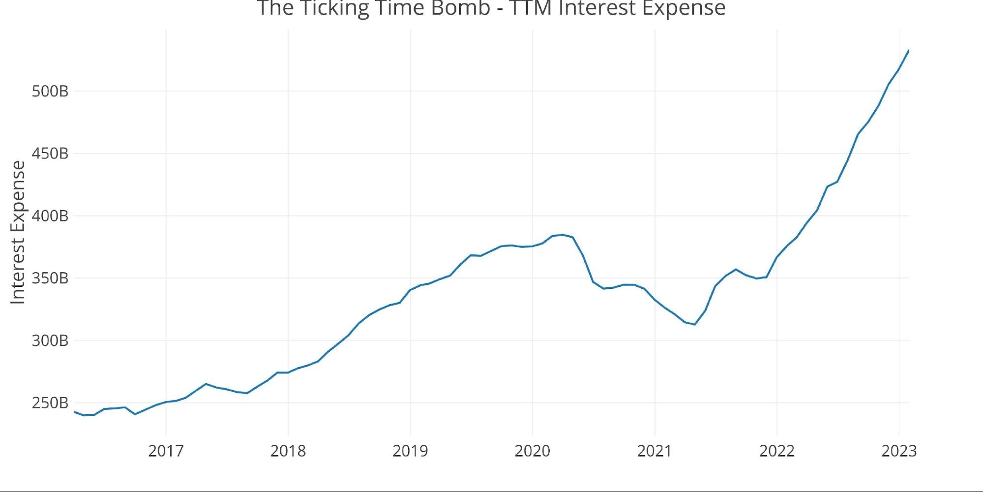
As discussed in the debt analysis, the total net interest payments on the national debt are still exploding higher as interest rates rise. In the latest period, the TTM interest expense was $533B dollars. Annualizing out the January Net Interest Expense pushes the total to almost $600B. That is just on debt servicing!
Figure: 8 TTM Interest Expense
The table below goes deeper into the numbers of each category. The key takeaways from the charts and table:


